PENGUIN RANDOM HOUSE AUDIO
PENGUIN RANDOM HOUSE AUDIO
Responsive website.
Website UI/UX
The website was originally done in Flash and redesigned in two phases. The first phase was to redesign the site following the UX of the company’s library website as a way to launch quickly. The second phase was to make the site responsive. Currently, we are adjusting the website in small chunks tailoring to audio’s specific needs.
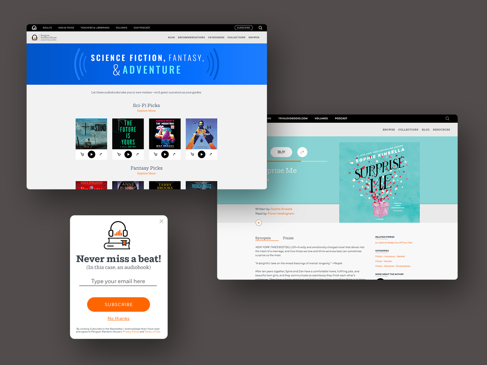
PRODUCT PAGE
PRODUCT PAGE
This is a site for audiobooks so in redesigning the product pages I decided to place audio first. The audio clip is the main deciding factor for many users therefore it’s important to be prominent. Unlike books, most users will still pick up another if it is not well received but with audiobooks, users may never give it another chance if it is not cast well or if the production quality is just not good enough.

The background picks up the product image color at 80% value and based on the contrast the buttons, scrubber, and text is either white or black.

The purchasing functions as an overlay also picks up the product color. This functionality is repurposed for quick view/buy.

In addition to sharing on social media channels, I proposed an audio embed functionality.
COLLECTION PAGE
COLLECTION PAGE
Quick view/buy was requested by the stakeholder to help generate more impulse sales. Instead of having an overlay button on top of the product image as seen on many websites, I decided to place it on the control panel below the product for two reasons, 1. avoid users from misinterpreting quick views for product pages and 2. avoid users from accidentally opening the product page instead of quick view and vice versa.

The header image is as bright and playful as the advertising for a seamless experience clicking through the ad.
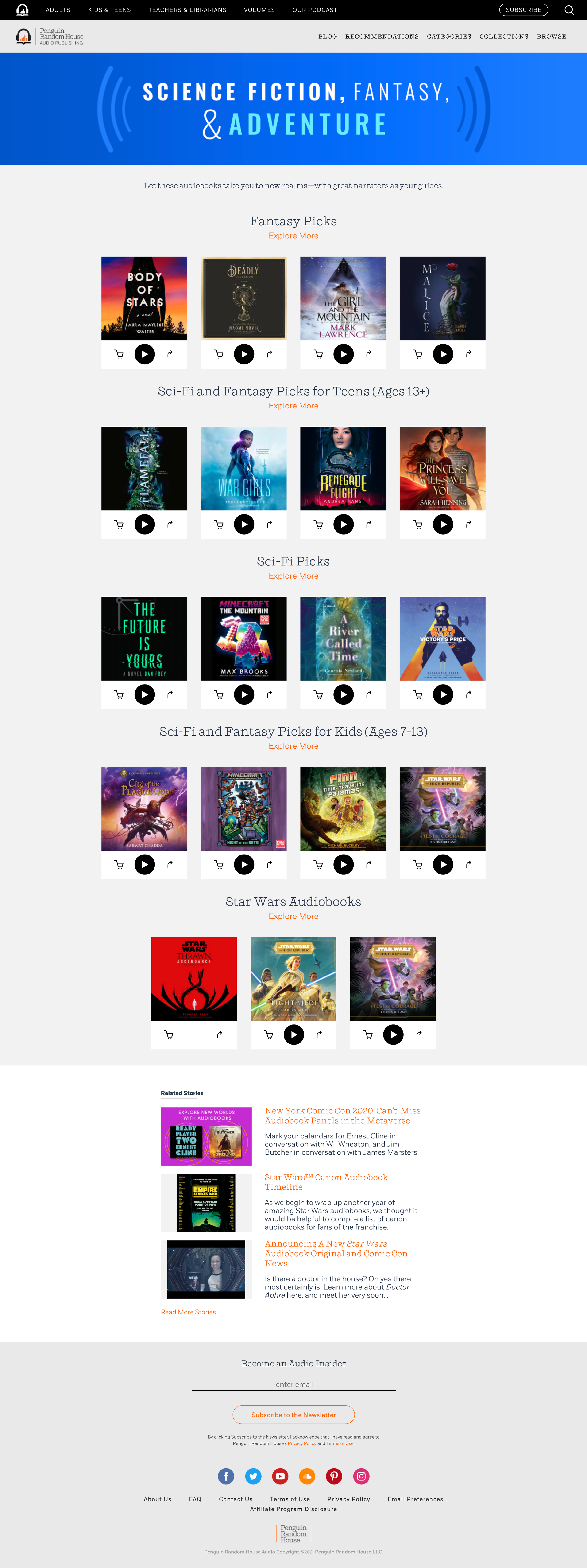
Quick view/buy repurposes overlay functionality of the product pages, “killing two birds with one stone.”
PREFERENCE CENTER
PREFERENCE CENTER
The Data Analyst came to me with a problem, “We currently don’t have much information about our newsletter subscribers.” Our goal is to come up with a UX solution to capture information from subscribers new and old.

I created a user flow that revealed additional pages we needed to account for.

Made sure the new elements are consistent with the brand and covered accessibility.

A page in need discovered from the user flow was the unsubscribe page. This page utilizes survey monkey embedded for tracking purposes.

I presented two wireframes, one based on icons and one based on checkboxes. Even though the icons were in line with a competitor’s preference center the stakeholder preferred, we quickly realized it didn’t fit our content and the usability of the checkboxes was a better choice.


SUBSCRIBE POP UP
SUBSCRIBE POP UP
Design and copywriting for an engaging pop-up to gain subscribers utilizing branded colors, icon style, and tone of voice.